Tuesday, June 23

The Right Way to Update Your Old Website

church website
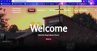
I updated a website several years ago for a church in Milwaukee. Basically, it had a website that was broken (and potentially hacker-dangerous) because it was built on Joomla 1.0 technology. The church assumed I would be building a whole new website, but when I saw that several articles were approaching 10,000 hits, I figured it was better to migrate the website. 

I was able to keep the website intact, with most of the articles in the same place for search engines. The only problem was that I tried a little too hard to simply reuse elements of the old site in the new one, so I had random images and modules that looked a little out of place. Also, in attempting to mix the old color scheme with a new one, the sub-pages did not match the home page perfectly. And then I was asked to add even more to the page, like the full (long) name of the church, and a kind of ugly calendar component.
Since my main goal was to get the website migrated to the newest version of the CMS, I didn't really try too hard to make it look perfect, especially since I'd given a low price, and I'd already done more work in hours than the price warranted. Instead, I suggested the church use the new site and then let me know about changes.

Every six months or so, I'd get a request for a small change, or else someone at the church seems to have made one, and each one of those changes were more for usability rather than aesthetics. Therefore, by the time I was contacted again about a new website, the one I had created initially looked kind of like the same hodgepodge I'd inherited.

The good news was that I'd kept the website updated with the latest cms version, so adding a new template would not be an issue. But a new template peppered with all the same random modules would have been just as disjointed. This time, however, a church member had a plan (and even a wireframe) to ensure I was only going to add the elements that everyone wanted.

One of the main requests was to have the menus look the same on all pages, including the main page. A lot of times, modern templates will use a different color on sub-pages, and if you add old imagery as a header image on those sub-pages, then you end up with a website looking like it's using two different templates. With consistent menus and a paired-down use of modules on the site itself, the site looks cleaner. I had been asked (once again) before the redesign if it made more sense to start over completely. As before, my answer was that it was better to keep all those articles and menu positions if possible. Changing how a site looks doesn't have to change the important searchable content on the site.

The revised website was what the church wanted, maybe even from the beginning, but it needed someone who would organize those thoughts into a single plan. The biggest challenge will be when someone asks about those stained glass images or the facade photo or another random module I or someone else added to the home page. Or when someone wants 10 new categories in the menus. Until then, the website looks pretty good. 
Contact Brian

Name

Email *

Message *

Pennies From Heaven AKA Welfare for Writers

The reason why we have ads on this site is because that's one way writers make money online. Your presence on this site right now might make a penny for our family. Clicking on an ad might get us closer to $.50. Buying something online as a result of clicking on a link can make us a few dollars. We will not get rich from this money, but every penny helps out. Every like or share or re-post or follow. Please, make a donation to our family by clicking.

JAX Weather

Labels

Jacksonville jax money Florida crime housing activities vehicles economic development school home news transportation planning police Duval website design kids politics traffic research TV neighbor reviews sports taxes parks statistics East Arlington writing history environment St. Johns roads travel water employment fun men previous owner rankings Arlington weather women beach review business church jaguars pollution dating fashion football guns hurricane library race tourism fatalities health care zoning baseball music JEA Mayport restaurant summer animals games military unf Lyft St. Augustine education flooding pets spanish AC Halloween farms film french hockey noise ocean po radio Duval County Fletcher high school armada cats christmas controversy debate decision fall fort caroline style superhero 2021 AAA Roadside Assistance Advice Blowhard Cambridge AICE County Sheriffs Duval County Public Schools Easter FDOT FL Google Gyros Haretna Hilton Honors James jaeger Kernan Boulevard Lutheran Milano's Ocala Pressers SEO St. Johns County Starbucks T-shirts Tim Tebow VW acting ad of the week addiction again all balls arts asked avoid behavior belief best bi-polar boo celebration chances chump colleges column common comparison consequences councilmembers credit card cuisine difficult to use don't work doors driving games entertainment experience expression faith finding food frustration future gambling gaming gas station grass hack handles high school exchange homes housing market humor illegal traffic stops impact importance improve indians informed infrastructure insightful issue. killing language last chance light boat parade lights local dating scene lottery love made mascot meaning mental health merchandise mistakes mood swings no U-turn sign no brains notebooks opening opinion origins ownership party paying for hotels personal opinion pet ownership pitbull play players pooper popular pound sand program protect real estate reason reform religion request revenue rewards program rights road trip save school identity school pride school spirit service simple sketchy slang someone state struggle support system take down taste teachers thank you timucuan traffic laws traffic stop universities unpredictability usage vehicle pet peeves welcome workplace